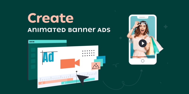
To create banner ads, design a visually appealing graphic and include a clear call-to-action. Use relevant keywords to attract your target audience.
Banner ads are a powerful tool for online advertising. They grab attention, drive traffic, and boost conversions. To make an effective banner ad, focus on simplicity and clarity. Use high-quality images and bold text to convey your message. Ensure your ad aligns with your brand’s identity and resonates with your audience.
Test different designs and messages to see what works best. Keep your file size small for quick loading times. Properly placed banner ads can significantly enhance your marketing efforts, leading to better engagement and higher ROI.
The Art Of Crafting Captivating Banner Ads
First impressions matter a lot. A captivating banner ad can attract many viewers. The ad should be clear and eye-catching. Use bold colors and large fonts. Make sure the message is short and precise. This helps to grab attention quickly. First impressions can decide the success of the ad.
Visual elements are very important. Use high-quality images and graphics. Animations can make the ad more engaging. Add a call-to-action button. This encourages users to click. Keep the layout simple and neat. Too many elements can be distracting. Use contrast to make important parts stand out.

Credit: www.youtube.com
Understanding Your Audience
Identify your target demographics. This includes age, gender, and location. Research where they spend their time online. Knowing their interests helps too. Use this information to craft ads that appeal to them.
Psychographics digs deeper than demographics. It looks at lifestyle, values, and opinions. Understand what your audience cares about. Create ads that speak to their emotions and beliefs. This connection makes your ads more effective.
Design Principles For High Conversion
Colors can make people feel different emotions. Red can make people feel excited. Blue can make people feel calm. Using the right color can make a big difference. People may click more if they feel happy or excited. Bright colors like yellow can grab attention. Soft colors like green can make people feel safe. Choosing the right color can help your ad work better.
Simple designs can be very powerful. Too many details can confuse people. Focus on the key message. Big, clear text is easy to read. High-quality images make the ad look good. Too much information can be overwhelming. Less is often more. Keep it simple and to the point. This will help people understand your message quickly.
Crafting A Compelling Call-to-action
A strong call-to-action needs clear and simple words. Use phrases like “Buy Now” or “Sign Up Today”. These phrases tell users exactly what to do next.
Make the button big and colorful. It should stand out on the banner. Bright colors like red, green, or blue work well.
Using Urgency And Scarcity
Create a sense of urgency with words like “Limited Time Offer” or “Only 3 Left”. People act faster when they feel they might miss out.
Highlighting scarcity can also push users to click. Show that the offer won’t last long. This can increase the click-through rate.
Optimizing For Different Platforms
Creating banner ads for both mobile and desktop can be tricky. Mobile screens are smaller. This means less space for text and images. Keep designs simple for mobile. Use bigger fonts and fewer words. Desktop ads can have more details. They have more space to fill. Balance the elements to make it look good.
Different social media platforms have different rules. Facebook ads can be square or vertical. Instagram prefers square or vertical formats too. Twitter likes horizontal banners. LinkedIn ads should be professional. Test your ads on each platform to see what works best. Each platform has unique users. Customize the message for each audience.

Credit: www.youtube.com
Measuring Success And Iterating
Track performance metrics to gauge banner ad success. Use data insights to refine and improve your designs continually. Regular adjustments ensure higher engagement and conversion rates.
Key Metrics For Banner Ad Performance
Click-through rate (CTR) tells how many people clicked the ad. Impressions show how many times the ad was seen. Conversion rate shows how many clicks turned into actions. Cost per click (CPC) shows how much each click cost. Return on investment (ROI) tells if the ad made money.
A/b Testing For Continuous Improvement
A/B testing compares two versions of an ad. One version might have a different image. The other might have a different call-to-action. This test shows which ad works better. Keep testing to find the best ad. Small changes can make a big difference. Always use the winning version for better results.

Credit: www.creatopy.com
Frequently Asked Questions
How To Create A Banner Ad For Free?
Use free online tools like Canva or Adobe Spark. Choose a template, customize text, images, and colors. Download your banner.
How To Develop A Banner Ad?
To develop a banner ad, choose a compelling image, write a clear message, include a call-to-action, optimize for size, and test performance.
How To Put Banner Ads?
To put banner ads, select a platform, create the ad, set targeting options, and place the ad code on your website.
How To Make Google Banner Ads?
To create Google banner ads, use Google Ads. Design your ad in the “Display Network” section. Choose ad sizes, upload images, and add compelling text. Set your target audience and budget, then launch your campaign. Monitor performance and adjust as needed.
What Are Banner Ads?
Banner ads are graphic advertisements displayed on websites to promote products or services.
Conclusion
Mastering banner ads takes practice and creativity. Follow the steps outlined to create compelling, effective ads. Remember to test different designs and placements. With dedication, your banner ads will attract and convert your target audience efficiently. Keep refining your approach to stay ahead in the competitive digital landscape.
